.png)
Process Breakdown - R.P.D. Invasion
- Matheus Freitas

- Oct 30, 2020
- 11 min read

Resident Evil is my favourite video game franchise ever. It stays right there at the top of my list as it has for years now. I first got in touch with it through the 4th entry in the main series: Resident Evil 4. The game was responsible for popularizing the over-the-shoulder camera in third-person shooters and it was just a blast!
It is not the first time Resident Evil made an impact. The first game was revolutionary, basically creating the Survival Horror genre. The second one was even more popular and successful. We got a remake (or reimagination) of the original Resident Evil 2 in 2019, so expected by fans, who have been asked for it for years and being promised that it would happen in 2015, with the "We Do It" video.
Resident Evil 2 remake was critically acclaimed and nominated for game of the year at The Game Awards. This was great for the franchise as it has been losing the fan's trust after Resident Evil 6, and while it did well with Resident Evil 7, some fans were still skeptical.
Resident Evil 2 is my favourite game of the whole series by far, and I was surprised when I realized that as a fan I never really did any art of this franchise. Needing to get over a creative block and wanting to attempt a new approach to background painting, I started working on this little project, that allowed me to experiment with a lot of different techniques and have some fun paying tribute to a series that was a big part of my life.
Reference Research
The very first thing I did when approaching this project was to gather references. This was an unusually fun part of the process.
The tricky thing about painting the Raccoon City Police Department from outside is that in the game you spend most of your time inside the building. While this is a very memorable structure indoors, I only had a general idea of how the outside looked like, which is far from enough when making a painting.
That being said, I started like anyone else: looking up images on Google. Since I am a big Resident Evil fan, I knew that there would be some accurate 3D model imagery outside of the Police Department on the internet. I was even lucky to find good images of the remake's building rather than the original one.

That alone was not enough, though. I had to dig dipper and look for YouTube videos where people break the game's boundaries, hoping to see more of the structure. I did actually find a video which had some good angles of the building's facade, but not only the video quality was not very good, the game is pretty dark.
It was then that I went into the most fun part of this research, which was launching the game myself and taking some screenshots. I was able to capture lots of very specific details when doing that, and not only from the R.P.D.
I actually took screenshots of other elements in the city, such as background buildings, walls, ornaments, lamps, cars, and much more. It was a great experience that made me appreciate a lot the work that was put into this game and how tiny details make a huge difference.

I also got the chance to catch some inconsistencies that I wouldn't otherwise. For example, the first floor of the building - in the Main Hall specifically - from the outside doesn't match the inside. It's clearly something we never realize while playing, but it was an interesting find.
Okay! With reference images collected, I gathered all of them in a Photoshop document as if it was a pinboard. I then started taking notes and drawing on top of the screenshots analyzing all the elements I thought were interesting and useful in those images. A very crucial part of the whole process, since it made everything much easier later.

Painting Assets
Usually one would start painting an environment by sketching some thumbnails, exploring compositions and all that jazz. While I still did that, I wanted to start light and easy.
You see, figuring out a good composition is hard (at least for me)! It takes some brainpower and energy to get there, and I didn't want that at the time.
Instead, I started small and painted some assets. The very first thing I painted in the whole image was the front door that doesn't even appear in the end. You can see it here


Painting assets can be wonderful or terrible efficiency-wise. It's definitely helpful when you need to make other backgrounds since you can just slap that in and do some adjustments to make it fit into whatever you're doing. However, if you are going to make a background just once of a building that has a very specific architecture, maybe making assets of it is not the best call.
It's fun but still takes time. While you get to pay closer attention to the details, in the end, it just takes too long. Besides, if I had done a thumbnail beforehand, I wouldn't have painted a whole chunk of the building that doesn't appear at all.
The part where you pay more attention to the details is true though. Funny enough, too many details are still detrimental to the image. When working on brick wall textures, I wanted to have it more painterly than accurate, which led me to take advantage of big brush strokes, with only some lines in some areas implying that there are many bricks. I also used the lasso tool to make shapes that give more texture to the material.

I had done each individual brick, everything would fall apart and the painting would be simply too overwhelming to look at. This approach not only looks better but also more natural. The less refined areas even look like moss and dirt that may have accumulated in between the bricks.
I had the same approach to everything else in this painting, trying to always keep in mind the idea of suggesting detail rather than actually detailing it.
Thumbnails
After having some assets done, I finally decided to do a few sketches to figure out what I wanted to do with those assets after all. I had a rough idea in my mind on how I wanted it to look, so finding the right camera angle wasn't that hard. It only took me a few iterations to get to the composition I wanted.

Putting Assets Together

Putting assets into perspective can be a tedious and repetitive task, especially when you have to place every single door and window accurately. With that in mind, I put some assets together in a flat, frontal view, forming whole parts of the building facade. I did this for every bit that I thought was necessary... which ended up being all of them (yes, even the bits that don't actually appear in the final image).
Once again, this approach was great for paying more attention to details. I remember it being a lot easier to deal with ambient occlusion. I basically used the marquee and lasso tool to make a selection and the gradient tool to paint the AO. Even then, I used more the marquee than the lasso, which is far easier and quicker to use.

Final Image Assembly
Having the composition figured out and some assets put together, it was time to get to the real thing. To make sure things are mostly accurate, I put the thumbnail I did on the back and increased it's size to occupy the whole canvas and lowered its opacity. It is a very blurry version of an already rough drawing, but it's more than enough for getting started.
The very first thing I did was to create the perspective grid. I did have perspective in mind when thumbnailing. I had even defined a horizon line and vanishing points. However, given the rough nature of that drawing, the perspective was wrong in many places, and that needed to be corrected.

Making the perspective grid in Photoshop is actually very easy. I remember once watching a video by Ethan Becker where he makes a perspective grid using what he calls the "Star Thang". With a name that unique, it is very easy to remember how to do it, considering the process is also very simple. It is not the most efficient way of doing it though.
There is another way that works much better for me and might work better for you too. It has more steps and is very Photoshop specific, which can be very easy to forget (just come back here to check again if you do forget). Here's how you do it:
Select the "Polygon Shape" tool (stacked together with the line and shape tools)
On the top bar set the number of sides to 100
Click on the gear icon next to "Sides" and check the "Star" check box and set "Indent Sides" to 99%
Click and drag on the canvas
Although you can make this vanishing point as pixels, I recommend to keep it as a shape. That way, you can easily adjust its position without affecting or losing part of your grid. Using the "Direct Selection Tool" (popularly known as the "White Arrow/Cursor"), you can select all the points around the centre of the vanishing point and move it around, while all the other points remain intact and unaffected.
Another good tip for dealing with perspective is using a guide for the Horizon Line. That way, you can always hide it by pressing Ctrl + H. You can also use vertical guides to mark vanishing points outside of the canvas.
Once the grid was ready, I started putting the assets I had previously done into place. This step involved a lot of skewing and distorting. It is very easy to place assets that are flat or perpendicular to the floor, but the moment it has some sort of inclination, some drawing on top was required. I could and thought of attempting placing tilted assets just by feeling, but in the end, I would have just spent more time fixing my mistakes than I did by actually figuring out the perspective. Also, drawing in perspective like this is kinda fun.

I mostly made assets front view, meaning that I had to make the planes that give depth at the moment. Luckily, these are areas that are either not the focus or that don't catch enough light to justify details there. That means that I only had to make flat-coloured shapes.
The trees were super easy to do, and that is because I didn't really make the trees. Do you know when people say that there is no magic button to make a pretty painting in Photoshop? Well, it's true, but there is one for making trees. Not very good looking ones, but great ones for starting points. I made 3 variations of trees using Photoshop's render filter "Tree", adjusted their position and perspective, and changed the colours and lighting to match the rest of the image.


For the cars, I took a similar approach to the assets. However, instead of using Photoshop to distort the planes into place, I did a very basic, rough model of a car and painted the details on a UV Map. I then imported the 3D model with the textures into Photoshop and painted on top until it got to how it looks like in the image below :

Now, I would say that this maybe wasn't the smartest approach for the car. It took me much longer than I expected to match the 3D model's perspective to the painting's, and the lighting was terribly off initially. I still needed to do some significant adjustments to the front car's perspective after that, and the flipped car is not even a 3D model. It's just a photo texture of underneath a car with some wheel painted on top.
During the process, I wondered if that was a good approach, and if I was doing it now, I probably wouldn't take that path. Still, it was fun to experiment with Photoshop 3D and implementing 3D models for my 2D paintings. It's something I have done before and has worked pretty well. It just didn't work as well here.
The ground is something that I have seen many people overlooking. I myself have done it multiple times before, and it makes a difference when some attention is given to it. I didn't do anything too creative, but I did add some details that gave it more life.

I have started making an asset library a while ago that has been useful in some of my projects. I did some trash piles, dirt accumulated in between the street and the sidewalks, street signalizations, manholes, and I used all of them in this image. You can find them all if you pay close attention to it.
There were 2 elements in the ground that were not assets, which is the wet part reflecting the building and the cracked glass. This last one is barely noticeable, but it brings life to the scene. Besides, it would be very unlikely to have no glass shattered on the floor with a flipped car like that one.

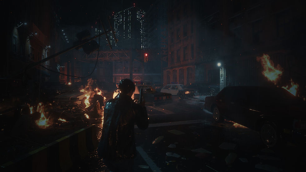
In this image, I think there are only 3 to 4 zombies that I painted myself at the moment, which are the ones at the gate and maybe one walking towards. The rests were images and silhouettes taken from the internet. Some of the were random, generic silhouettes, others were from The Walking Dead, and the one zombie on the right, blueish side of the image is the first zombie from the remake of the very first Resident Evil game. That zombie is so iconic that I remember seeing its render either on the cover or on the back of the booklet that came with the GameCube game. It had to be there.

Post-production
The final steps were all about adding the final touches. Many of them are barely noticeable but make a huge difference. I started by picking all the layers I had separate in different folders and merged them all into a single one (as a copy to not lose all the process).
The first thing I did is something that I just recently started paying attention to in my work, which is edge control. In digital art, it's very easy for everything to look very sharp and... well, digital! By looking a some great artist's work and watching some videos on the internet, I started being more mindful about the edges in my paintings and how to use them to draw more attention to specific areas and away from others.
Composition and edge control works together. In fact, I'd say that edge control supports the composition, as the second one on its own already does the view-guidance job. I find it's very appealing to blend and smudge some edges in areas that do not draw much attention while keeping them sharp in the focal points. You can see that the buildings in the background and even a bit of the top of the R.P.D. building has some blurred edges, while the R.P.D. the logo is super sharp!

There are also levels of edge sharpness. I see most artists categorizing them into sharp, firm, soft and lost. When well used, the lost edges are especially beautiful!
After that, I painted some random brush strokes with some primary colours (Cyan, Magenta and Yellow) and set the layer opacity to around 5%. That gives some subtle hue variations that make the image more interesting to look at. I usually add noise as well, but I do not remember if I did for this one.
The very last step is always my favourite part: chromatic aberration! I just love the retro look of it, and I try to implement it into most of my drawings. It doesn't fit some of them, but I think it works very well for R.P.D, not only because of its horror theme, but also because the game happens in 1998, and I feel that the chromatic aberration makes sense in that context.
If you got all the way here, you are a true warrior! I recognize this is a lengthy post, and I really appreciate the time you took to read it. I hope it was entertaining and informative, and that you will get at least a thing or two out of it.
This was a very fun piece to work on, where I got to be experimental and try new and different approaches to background painting, including mixing medias such as 2D & 3D. I learned a lot of dos and a few don'ts and was able to put new knowledge into practice.
I got very proud of the final result and I want to do similar artworks to this one in the near future.
Recent Posts
See All
Creating a blog is something that I wanted to do for a long time, yet it still took me a school assignment to actually go ahead and do...
Comments